
I understand why sponsorships and ads are necessary. I don’t mind there being an ad for MasterCard on the back of the pitching mound and it doesn’t bother me when a stadium gets renamed after an insurance company but the sponsored patches on the jerseys I find very annoying. These sponsored patches started in 2023 and have slowly spread across the league to the point where today there are only 6 teams who’s sleeves are unsullied by sponsorship.
Last year when the Orioles announced their T. Rowe Price patch I was tempted to declare that the Orioles had the worst sponsored patch in the league but before doing so I did some research and found at least 1 patch that was worse. At the time there were 20 teams with jersey patches so I published a rankings of these patches that can be found here.
Since then 4 more teams have added new sponsored jersey patches and some of the teams on the list have adjusted their patches so the patch power rankings have experienced a shake up at the top so I’ve decided to revisit the list and adjust for the newcomers.
Every MLB Team’s Sponsored Jersey Patch From Least to Most Offensive
Here is the criteria for a “good” jersey patch
Quantitative Criteria
Size
How big is the patch? How much of the player’s sleeve does the patch take up? If there is print, can you read it on the batters arm from the broadcast’s default angle?
Obviously the smaller and more inconspicuous the patch is the better. Ideally it should be small enough that I shouldn’t be able to tell if it’s an ad or a decorative patch until there’s a close up.
Color
Does the color of the patch match the team’s color scheme? If not, is it at least black and white? Surely you didn’t get a patch with clashing colors that make it pop like a statement piece on the red carpet?!!
Ideally the color should match the team’s jersey enough so that even if it’s a large patch it blends into the jersey and after watching for a few innings you barely notice it.
Qualitative Criteria
Historical Significance of the Jersey
You will be judged more harshly if you put a stupid patch on a jersey that’s existed in baseball since the 1800s than if you put a patch on a jersey that’s been around since 1990.
Annoyance
What I have found is that some patches are just annoying to look at. It could be a collective of things or something intangible but some patches simply have a “make you roll your eyes” effect to them.
Before we get started with the rankings I want to congratulate the 6 teams who either have not bent the knee to the sponsor patch or, perhaps more likely, have not been offered the opportunity to get one.
The Twins
The Rays
The White Sox
The Athletics
The Nationals
The Rockies
Rankings
24. The San Diego Padres – Motorola

The Padres maintain their position as having the least offensive jersey patch in baseball. Sizewise it is not the smallest of patches but there are several contributing factors that make this patch more palatable than all the others.
The colors match the jersey very well and that is not by coincidence, if you look at Motorola’s logo outside of baseball it usually appears in black with the occasional red or blue variation but never brown. Clearly the Padres bargained to have the patch match the jersey which is not something every team was willing to do. We will see in this list lots of teams who couldn’t be bothered to make their patch match the team colors or even be neutral. So the Padres getting Motorola to do their logo in Padres brown is a win.
Next is the fact that there is no lettering on this patch. We will see on this rankings plenty of patches with letters large enough to read while you are watching the game but this Padres patch offers no such distraction. That’s not a given either as the Motorola logo routinely appears with the word Motorola below or next to it and as we’ll see with other patches it’s not a rule that you have to pick between the logo or the name of the company.
As a bonus to the lack of lettering the Motorola logo is sufficiently abstract so that if you tuned into a broadcast and didn’t know about the Padres sponsored patch you wouldn’t assume that the Motorola patch is an ad. Teams have patches commemorating different anniversaries or former executives so it’s not jarring to see a patch in general as long as it matches the team color scheme.


23. The Chicago Cubs – Motorola

Obviously this is the same patch as the one on the Padres so everything I said about the Padres patch holds true for the Cubs Motorola patch. The reason that I would say that the Cubs’ patch is slightly worse is that the Cubs brand has been around for so long and they’ve kept very true to their brand for decades and decades and they play in one of the oldest ballparks so having a phone company patch is just a little more sad.
The Cubs franchise began in 1870 and they first added red and blue accents to their white jerseys in 1901 even before they became the Cubs. The C on the left chest of the jersey has been around since 1903 when they became the Cubs and in 1907 they introduced their pinstripe jersey.
So for longer than anyone on this planet has been alive the Cubs uniform has been more or less the same. That doesn’t make it a crime to add the Motorola patch but it does make it a little worse than adding a patch to the Padres who have been around since 1969 and have had a half a dozen rebrands in the last 20 years.


22. The New York Mets – NewYork Presbyterian

The Mets patch is a shining example of what a patch can be. When the Mets got the first version of their sponsor patch it was an absolute eyesore. It was big and it was red and it was gross and after a half season of it in 2023 the patch team got in the lab and cranked out this much more understated piece of work.
This patch is quite small, it’s Mets colored and of the two words on the patch one of them is NewYork (which I would usually say is 2 words but they’ve crunched them together) which is also about half of the New York Mets team name.
At a glance this might as well be a Mets patch.


21. The St Louis Cardinals – Stifel

The Cardinals Stifel patch has a lot of the aspects of a great patch. Colorwise it matches the Cardinals red very well and similar to Motorola Stifel’s logo does not usually appear in red so that means the Cardinals negotiated having the colors match.
Because the background of the patch is white you basically can’t see the patch from far away but unfortunately it is large enough that on any close ups it is very clearly legible. It’s a unique give and take that makes it a little hard to rank but at the end of the day you can watch a Cardinals game and mostly tune out this patch.
As an added bonus on the away version of the Cardinals jersey the background of the patch is also gray to match the jersey. This doesn’t sound like much but some of the patches we’ll see later in the ranking have different versions based on the jersey to make it stand out as much as possible. No matter what jersey the Cardinals are wearing they are committed to a low impact patch.


20. The Milwaukee Brewers – Northwestern Mutual

The Brewers threw us a changeup! They updated their patch and if you google any variation of “Brewers 2025 Sponsor Patch” “Brewers 2025 Jersey” it will not show up but if you watch a Brewers game you will see that their patch is larger than it used to be and contains a yellow trim that makes it pop against the jersey. The trim does make the patch look a little nicer which is good from a marketing perspective but it also makes it much more visible which is not what we are going for here.
Also the old patch more closely matched the Brewers’ color scheme and this new one is a lighter shade of blue than the blue that is most prominently featured on the Brewers uniform which makes it stand out even more.
They also have an alternate version of the patch for when they wear their dark blue top that makes it stand out more which I don’t care for.
These changes take the Brewers sponsored patch from one of the most discreet to slightly more visible. On the plus side it is still one of the smaller patches and the lettering is small enough that even on close up shots it is hard to make out the words.


19. The Detroit Tigers – Meijer

Another tricky one because if you google Detroit Tigers sponsored patch the images are only of this not overly invasive version of the patch which goes on the home jersey.
The home jersey patch is not all that bad. The background is white like the Cardinals Stifel logo; the letters are in a bolder font so it doesn’t disappear in the far away shots and it is even more legible in the up close shots. It’s sneaky big but not in your face.
The away jersey patch is not so unobtrusive. The patch is dark blue with orange highlights and a white trim with bold white lettering which stands out quite a bit against the road grays. Also, I don’t know if this is an equipment manager thing but as I watched some condensed Tigers road games it seems like the sleeve the patch is on has a weird fold in it and it wasn’t just one player or one game where I saw this fold in the patch. You can see it in the screenshot I took.
To the Tigers’ credit usually the Meijer logo appears in a red and blue reminiscent of the Philadelphia Phillies so it is good that in both versions of their patch it appears in Tigers colors.


18. The San Francisco Giants – Chevy

The mostly black patch stands out against the cream and gray jerseys the Giants wear most of the time so when you tune into a Giants game you really can’t miss this patch but one of the Giants main colors is black so it’s not exactly a crime that there should be black square on the sleeve.
I also don’t love the fact Chevy got to include both their logo (which is very well known) and they got to throw in the entire word CHEVROLET in all caps. I suppose the word is important so they could emphasize the EV part but a words plus logo is a serious demerit in these rankings. The logo and word combo results in this patch being highly legible throughout the game.
This patch does get points for matching the team color and for being on the smaller side compared to what we are about to get to in these rankings.


17. Los Angeles Angels – FBM

The Angels patch has a lot of things I don’t like. They have the company’s logo, acronym and full name all crammed onto the patch, the patch has 6 different colors which is easily the most color on a single patch in all of baseball and above all it’s ugly.
So how did it end up on the back half of the list? This patch’s saving grace is that it is small. On the further away shots you can tell there’s a patch but you can’t tell what it is and even on the close up shots the words Foundation Building Materials are barely visible.
Another small thing is that they don’t change the color of the trim when they play in the red jersey. Some patches have multiple trims depending on the uniform color and angels just keep the same red trim so when they wear their red jerseys the patch appears even smaller.
In a troubling trend I did notice their patches seemed to be creasing in a way that looks uncomfortable and cheap similar to the Tigers patches.


16. The Cincinnati Reds – Kroger

Both times I have done these rankings I have started off thinking that Reds patch wasn’t so bad and then after watching only a few minutes of Reds baseball I can’t help but be annoyed by this patch, especially on those road gray jerseys.
Maybe my mind is tricking me because when I think of Kroger brand I think of the cheap grocery store brand option but this patch just looks cheap. It looks like a price tag that the whole team forgot to take off.
It also displays the Kroger logo in blue which is antithetical to the Reds color scheme and as we’ve seen from the patches before it isn’t that hard to ask the sponsoring company to present their logo in your teams’ colors. The Reds colors are red, white and black how hard would it have been for the Kroger logo to be black on this patch?
On the plus side this is a relatively small patch and on the white home jerseys it’s not too noticeable. Those two facts are enough to keep the Reds out of the top 15 because we are about to get to a part of the rankings where the patches have very few redeeming qualities.


15. The Arizona Diamondbacks – AVNET

The Diamondbacks were the single biggest fallers (that’s a good thing) in these rankings this year. If you look at the D-Backs patch last year it was massive. It was basically this patch but with a big black ground extending out to take up almost the whole sleeve. Honestly they got off easy with their 8th place rankings last year.
My commentary last year was that it needed to be about ⅓ of its size and just by taking off the big black square they have almost accomplished that but the lettering and the logo are still a problem area.
Even with the changes this is still far from ideal. They have both the logo and the company name presented on the patch and it is still quite large. They could probably afford to go from a font size 72 to a font size 48 and it would still be clearly legible.
Colorwise it doesn’t clash so that’s a small win for the D-Backs.


14. The Texas Rangers – Energy Transfer

The Rangers were also big fallers in this year’s rankings. The reason they were ranked 10th last year was because I thought it was disappointing that they won the World Series and then added a rather large sponsorship patch to their jersey.
I felt that winning the World Series should give you sufficient leverage to tell Energy Transfer that if they want to put a patch on your jersey it’s going to be small. Anyway a year has passed and the Rangers missed the playoffs last year so I’m just not as bothered by their patch as I was before.
As far as the negatives it is large, they have multiple versions to optimize the visibility on TV (bad thing) and Texas energy companies are still scammers so all that is working against this patch.


13. The Cleveland Guardians – Marathon

This patch went on an interesting journey for me. At a glance I wasn’t overly disturbed by this one but as I watched some Guardians games last year and watched some condensed games from this season it was bothering me more and more.
I had known that the red and blue in the patch didn’t match the red and blue on the guardians jersey so that wasn’t a surprise but the more I watched the more the different shades clashed on the screen. I also honed in on the light blue trim around the dark blue trim on this patch and that annoyed me as well.
“So you’re going to put 2 shades of non matching blue on one patch” I thought to myself and then typed out thinking to myself all the while that this was good foreshadowing for one of the worst patches in the league.
Anyway the big M doesn’t help this patch either, there isn’t an “M” anywhere in the words Cleveland Guardians. Is that a fickle complaint? Perhaps yes but I can’t help what stands out to me when I look at these patches.
We’re also getting to the part of the rankings where the patches will continuously uptick in size and shape so the small rectangles you grew used to in the first half of the rankings are mostly history.


12. The New York Yankees – Starr Insurance

The Yankees are another big faller in these rankings. The reason they found themselves at 7 last year was because I heavily penalized them for staining their classic uniform that had managed to remain more or less unchanged since 1912.
They never had a weird 1980’s futuristic jersey, they never wore a tank top or incorporated a gradient. If you took someone to a Yankee game at any time in the last 100 years a lot of things might be different but the jersey’s would be more or less the same.
Between the logo and the pinstripes the Yankees have by far the most recognizable brand in baseball.
This offseason the Yankees bailed on their long held grooming standards and when you watch a game they’re trying to incorporate all these off pastel colored arm sleeves and that’s fine the team is allowed to branch out and adapt but if they’re not going to care about their traditions I’m not going to care about them either.
So why have them at 12 when their patch is relatively small compared to the other patches around this part of the rankings? There’s 2 reasons. Reason number 1: I still care a little. Reason number 2: It’s just so unnecessary, the Yankees make money hand over fist and there’s no way this jersey patch is moving the needle in a significant way. They’re basically getting a free QO player for this patch and I just don’t think that’s enough to justify it.
11. The Philadelphia Phillies – IBX

Whoo! This patch has a lot of stuff I don’t like. Right off the bat I see the name of the company, the acronym for the company and the logo for the company. Just pick one!
This is on the Phillies for not pushing back enough. They are a massive brand and one of the winningest teams of the last half decade so they should be able to look the IBX marketing people in the eye and say “You can put your logo on the patch or you can put the acronym but you can’t have both.” and instead they seem to have said “hell yeah! Let’s see if we can make this patch more crowded.”
Because they have to fit all this garbage on the patch it’s a much longer rectangle than what we’ve seen earlier in this list getting to the point where it is almost ⅓ of the sleeve. Look at the other rectangle patches on the list! It is not a hard size to scale down.
Also the blue on the patch is shiny which is uniquely bad to this patch.

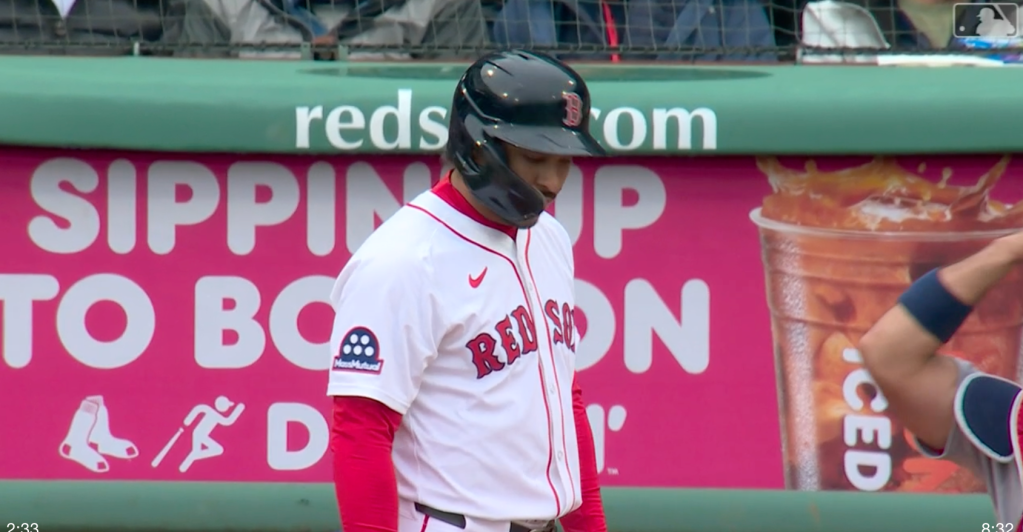
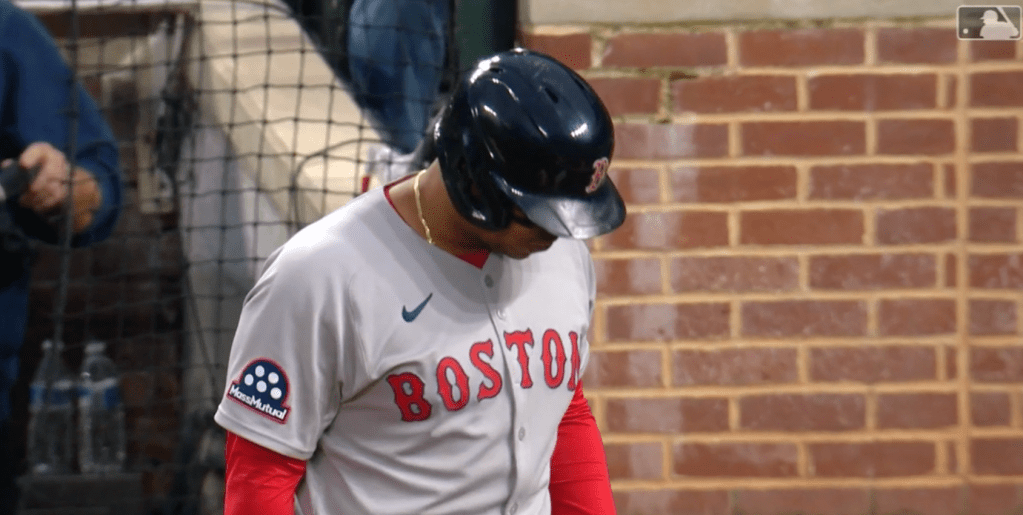
10. The Boston Red Sox – MassMutual

What the hell is this?! Last year the Red Sox had their sponsored patch with Mass Mutual and it was one of the more discreet patches in the league. There’s no “good” patches but the dark blue rectangle didn’t stand out too badly on the Sox jerseys. So imagine my surprise when I tuned into Orioles vs Red Sox last week and the Red Sox now have a brand new patch.
It’s not uncommon for these patches to change year to year, the Mets have changed their patch to be less distracting and the Giants got a less conspicuous version of their patch after a test run. So did the Red Sox get a smaller, even less invasive version of their MassMutual patch?
NO!
Everything about this is worse. The words MassMutual are bigger, the five dots are bigger, and instead of a small rectangle they now have some sort of bowling ball/old timey film reel shaped patch taking up half their sleeve.
How did this happen? Last year the Red Sox had a documentary made about their season, this offseason they made the biggest trade out of anyone in the league and on top of that signed one of the biggest free agent contracts in their franchises history, and they have an exciting crop of prospects ready to debut this year.
This is the most exciting Red Sox team since they won the World Series and somehow MassMutual got in the negotiating room and said “We’re gonna need more real estate on that sleeve” and the Red Sox just capitulated?
It should have been the other way around! The Red Sox should have walked in and said “We’re doubling the cost of our sleeve patch and it has to be half the size and you’re gonna like it because we’re about to do viewership, attendance and impression numbers like you’ve never seen across all platforms!” and MassMutual would have folded like they had a bad hand.
What’s next? The Red Sox win the World Series and then in 2026 they wear jerseys that say MassMutual across the chest???
This patch is so embarrassing.
9. The Los Angeles Dodgers – Guggenheim

The Dodgers are the second biggest brand in baseball behind the Yankees and they are rapidly approaching the number 1 spot every year that Shohei Ohtani suits up for them. So it is a real shame that even though the Dodgers are printing money with Japanese advertising and selling out their stadium every night and going deep in the playoffs every year they felt the need to put a big ole patch on the jersey.
It’s especially disappointing because Guggenheim owns the Dodgers, so buying the sponsor patch is basically them just cycling their own money around. They are basically doing the Jay-Z in his own nightclub bit from that Aziz Ansari stand-up special, “YOU’RE CRAZY FOR THIS ONE JAY!” (Is that a weird comparison to draw?)
The way I read this is the Guggenheim group saw the sponsorship patch as an opportunity to get their name on the Dodgers’ uniform and bring themselves even more into the limelight.
At least with some of the other patches they can use the excuse that the money from the patch will help them pay for more players but this patch brings no new money into the organization. All it does is stroke the ownership’s collective egos.
It’s gross and it’s pointless and not to mention it’s large. I hate it.
8. The Atlanta Braves – Quikrete

This is an interesting patch. It is the only patch that has any sort of 3-D styling incorporated and in a way that looks better than some of the less inspired white rectangle style patches. Unfortunately for the Braves the goal of these rankings is to not stand out and when you watch the Braves play these patches are basically glowing on their sleeves.
“Good patches” are discreet enough that your mind can ignore them to the point where they are basically invisible. That’s why color is so important. I mentioned I hate the Dodgers patch on principle but when you watch the Dodgers the blue patch on their sleeve can be somewhat easily ignored.
It doesn’t matter how many Braves games you watch, these patches never fade. It insists upon itself.


7. The Pittsburgh Pirates – Sheetz

Does this patch/uniform combo make anyone want to get a quarter pounder with cheese?
Is it good when you are known as one of the cheapest teams in the league to get a patch on your sleeve that makes it look like a McDonald’s uniform?
The Pirates have had red in their uniforms occasionally in their history so it’s not as gross of a color inclusion as what is coming up in the rankings but they don’t have any red on any of their uniforms right now so this patch is definitely crashing the party.
This patch is on the small side but the way the red interacts with the yellow and black jerseys it pops off the screen in a way that probably makes the Sheetz marketing team very happy and makes me as a viewer of baseball very sad.


6. The Houston Astros – OXY

In the last rankings the Astros cracked the top three because I was disappointed that they let Oxy put such a massive patch on their jersey after they were the best team in baseball for almost a decade and every year they were at least getting to the ALCS if not the World Series and that is the kind of exposure that should allow you to have some leverage when you are talking patches with your sponsor.
If you’re the best team in baseball and you can guarantee you are going to be playing in the most watched games every year you should be able to tell Oxy, “Nice try but that’s huge so try again and while you’re at it make it Astros colors.”
But the Astros didn’t say that, they saw a massive patch with colors that don’t match any of their uniforms and said “No notes, send as many of these as you can.”
Anyway this patch still sucks BUT the Astros are no longer a guarantee to be in the ALCS so it’s not as bad as it was before. It’s still bad though.


5. The Kansas City Royals – Quiktrip

The Royals fought, clawed and scratched and managed to stay in the top 5 worst patches in baseball despite a newcomer planting themselves in the top 3.
The Royals’ whole thing is blue and white, every version of every uniform they wear is blue and white and the tiger’s blood QUIKTRIP patch absolutely radiates off the blue and white background.
The patch is so large and so red and the letters are so big you can probably read the QT from the nosebleeds. If you took someone who knew nothing about baseball to a Royals game and you sat them up in the last row of the stadium the first thing they would say would be “Why do they have the QuikTrip logo on their arm?”
If you are in charge of the Royals and you are looking for a sponsorship patch, one of the first things you have to say when you get in the room with the patch squad you’ve assembled is “We all agree it can’t be bright red right?” and someone might say “What if the Chiefs want to sponsor us?” and you have to tell them “I don’t care if Patrick Mahomes asks personally to sponsor the team if the patch is red we say no.” and then Patrick Mahomes appears from the shadows because he owns the team and likes to sneak around and listen in on meetings and says “I would never put a red patch on the Royals uniform because I’m not an idiot.” and that’s the end of that.


4. The Miami Marlins – ADT

I’ve been tuning into more Marlins games this year to watch the Orioles prospects they traded for and do some scouting on Sandy Alcantara. (Mike Elias please answer my email I promise it’s not the same screen shot of Sandy’s baseball savant’s page next to Charlie Morton’s baseball savant page as I sent last time)
Anyway everytime I go to tune into a Marlins game I think to myself maybe the patch isn’t so bad and then the first time they show a Marlins player it’s like an actual jumpscare how bad this patch is.
This patch is what I would professionally refer to as a double whammy. The blue on the patch does NOT match the blue of the Marlins uniform and it’s HUGE!
I don’t even really know what else to say this patch really speaks for itself. My only question is do the people that make the business decisions for the Marlins have to watch the games or are they only vaguely aware that there’s a visual element to the product.


3. The Seattle Mariners – Nintendo

The Mariners’ patch should have been received with vitriol and disgust but they tricked people into not immediately hating this patch because people do like Nintendo. When I first read that Nintendo was going to sponsor the Mariners I thought that was a pretty good sponsor compared to the gas stations and insurance companies that other teams got stuck with.
Then I saw the patches and it actually made me nauseous.
The Nintendo Switch 2 patch is literally everything wrong with the sponsored jersey patches. It’s big, it’s a shade of red that nobody should even be allowed to wear at a Mariners games. It’s got the words “Nintendo Switch” and the logo for the switch AND a big number 2 (this patch is a big number 2, lol, lmao) all crammed onto one patch. Crammed is actually the wrong word because there’s actually plenty of room on this massive red sleeve that they’ve sewn on the Mariners jersey.
There’s no amount of money that justifies a patch this bad.
The other plain nintendo patch is not as bad but it’s still super red which is not good.
Watching a Mariners game and seeing these patches is like when you watch an old movie and there is really bad CGI and all you can look at is how bad it is.


2. The Baltimore Orioles – T. Rowe Price

I’ll start this section with a text message from a friend of mine who is a fan of the Red Sox:

I am in the central time zone so if you do the math on the timestamp seen there you’ll find that this text was sent 1 minute into the first Red Sox/Orioles game of the year.
There is a lot to hate about this patch. It’s very large, it has multiple shades of blue which is a color that outside of Jackie Robinson day has never appeared on an Orioles jersey, and they got to put both their logo and the name of the company on the patch.
If you read last year’s rankings you’ll see that I pulled a bunch of examples of the T. Rowe Price logo off their website to prove that their logo does not have to be blue and it especially doesn’t have to be multiple shades of the blue AND it doesn’t have to appear with that dumb goat.
That goat is what I want to focus on now.
The two most famous curses in the history of baseball are the Curse of the Bambino and the Curse of the Billy Goat.
The Curse of the Billy Goat started during the 1945 World Series when the Cubs booted Williams Sianis and his pet goat from the stadium after his goat had been bothering some fans. (What a time to be alive) In response to this indignity Sianis declared “Them Cubs ain’t gonna win no more” and Cubs proceeded to lose the World Series and then never even make it to the World Series for the next 71 years.
Just 8 years after the Cubs finally broke the Curse of the Billy Goat the Orioles decided to add a patch featuring a Cubs’ blue goat on their jersey and they also plastered the goat image all around the stadium including a massive goat statue on top of the scoreboard.
Either out of ignorance or defiance the Orioles tempted fate.
The first time the Orioles wore their T. Rowe Price patch was June 11th 2024, their record going into that game was 43-22, they were one of the best teams in all of baseball and it seemed like they were only going to get better. Since that game they are 53-57 and they have been by almost any metric a well below average team.
I’m not saying the Orioles are definitely cursed but I am saying that they’ve been playing the way a cursed team would play ever since they put those patches on the uniform.


- The Toronto Blue Jays – TD Canada

At the end of the day the king stays the king when it comes to bad jersey patches. There are a lot of patches that unfortunately stand out against the background of their jerseys like the Mariners red patch or the Braves yellow patch but at least the colors of those patches are colors that have appeared on major league uniforms before and in many cases are least complimentary on a color wheel. You cannot say the same for the Blue Jays electric green TD patch.
The Blue Jays lime green TD patch breaks all the rules. The color is distracting and loud, the size is large and the logo is boldly printed over the loud patch in a way that makes it so you can read it clearly on the batters arm when the camera is in the default behind the pitcher position.
Besides everything, what is annoying about this patch is that it would be so easy for TD to either make it smaller or make it a Blue Jays colored patch. They have a pretty recognizable brand and the TD logo is displayed all over the stadium, I don’t think people would be confused if you made this patch blue. It would be SO much better if it blue and all it would take would be the Blue Jays sending TD a picture of the Motorola patch and saying “Do you see how they made this patch blue to match the Cubs jersey? Do that for us.” and because they have such an intense partnership that you can see all over the stadium I’m almost certain that TD would agree to that.
Maybe they did try and TD said “No and if you keep giving up lip we’ll make the patch even greener.” but we’ll never know.


Leave a comment