Last week the Orioles put out a SICK hype video announcing a long term contract with… T. Rowe Price for a big sponsorship deal that includes most notably a jersey sleeve patch. Ever since the new CBA announced that teams could start putting sponsored patches on their jerseys many teams, in fact most teams, have added sponsored patches to their jerseys.
These patches have slowly been rolled out across the league like a sad version of the Nike City Connect campaign (although some of the recent City Connect Jerseys have been so lazy/ uninspired that you could argue that they are actually worse than the ads) and as teams have announced their “partnerships” we have seen some teams get stuck with large and garish patches and some teams escape with smaller more discreet patches.
I held out hope that the Orioles would be one of the few teams to forgo having a jersey patch but knowing that it was pretty much inevitable that we would get one I kept my fingers crossed that it would be one of the smaller and less intrusive patches.
Alas when the T. Rowe Price patch was announced, it was pretty much my nightmare patch, it’s blue, it’s big and it prominently features the company’s primary logo. I was immensely disappointed and one of my first thoughts was “is this the worst jersey patch in the entire MLB?”
I knew off the top of my head from watching the games that I had been repulsed by the Blue Jays lime green patch and the Marlins gigantic ADT patch that looks like they pulled off a middle class lawn but I couldn’t remember every team’s patch off the top of my head. So I did some research and as a result I now have the information to make an official ranking of all of the Sponsored Jersey Sleeve Patches.
Every MLB Team’s Sponsored Jersey Patch From Least to Most Offensive
Here is the criteria that goes into the ranking:
To me a “good” jersey patch is one that is small, matches the team colors and is basically invisible so what we are looking at to rank these ads are the size, how well the colors match the jersey color and finally how much worse the patch makes the jersey. Now the size and color is easy to judge because but the “how much worse” grade is harder to give because it can change based on how good the jersey was before the patch, the history of the team and what the company paying for the patch represents so that is where there is the most wiggle room for judgment.
Before we fully dive into these rankings shoutout to these teams for still not having a patch at all. I will admit this is not a list of MLB’s heaviest hitters and some of these teams are so bad I wouldn’t rule out the fact that maybe nobody wants to put their logo on their jersey but nevertheless here are the team’s whose jerseys are still unsullied by sponsorship.
The Tampa Bay Rays
The Minnesota Twins
The Chicago White Sox
The Seattle Mariners
The Oakland Athletics
The Philadelphia Phillies
The Washington Nationals
The Chicago Cubs
The Pittsburgh Pirates
The Colorado Rockies
With the way these things go by this time next week maybe all these teams have announced heinous sponsorships and slapped McDonalds and Subway logos on some of these historic jerseys but as of right now these teams are holding out.
20. The San Diego Padres – Motorola

This Padres Motorola patch is by far the least offensive of all the sponsored patches. I appreciate the fact that the patch is brown to match the Padres primary color. Motorola’s logo is not usually brown so this is clearly a compromise to maintain the team’s color scheme even though Motorola’s normal black and white logo wouldn’t have clashed terribly like some of the other patches we will see later.
The Motorola logo also has the benefit of being pretty abstract; it’s just 2 shapes that come together to form an M but you wouldn’t necessarily know it was an M if you weren’t looking for it. I also like that that they decided not to include the word Motorola which if you look up their logo the symbol frequently appears along with the word Motorola
I will say that while sizewise this patch is bigger than some of the other patches later down on the list and I know I said the smaller the better but I watched some clips while I was preparing this list and I found that this patch blends in seamlessly with the Padres uniform.
19. The New York Mets – New York Presbyterian

The Mets patch is a great success story for these patches in the sense that they got a patch last year and it was huge and it had the New York Presbyterian logo displayed in red and everyone hated it. This year the Mets have adjusted the patch and it is now one of the smallest patches and the New York Presbyterian logo is displayed in New York Mets colors.
This is a Mets colored patch that says the words New York making it like 85% in theme with the uniform and when you are watching the Mets on TV you can barely make out the words. So it could just as easily be a Mets commemorative patch.
18. The St. Louis Cardinals – Stifel

This patch displays red letters with a slightly darker fringe on a white background. The color of both the letter and the fringe match the color and fringe of the Cardinals logo. Stifel’s logo is not typically displayed in red so similarly to with the Padres Motorola patch there was clearly some negotiating for the patch to match the team’s color scheme.
When you watch the Cardinals this patch is basically invisible, the only reason it doesn’t rank higher on the list is because the word Stifel itself doesn’t match the uniform quite as well as the two patches higher up on the list.
17. The Milwaukee Brewers – Northwestern Mutual

With the previous three logos I was impressed by the teams making an effort to match the patch to the team colors. In doing so they probably left money on the table. For this patch the colors do match to a degree but aI think that is just because Northwestern Mutual has a dark blue logo so I don’t think they had to go out of their way for this.
I would say this patches biggest redeeming quality is that it one of the smallest in the league and when you watch the Brewers not only do your eyes quickly breeze over it but you can barely see it in the first place.
16. The Boston Red Sox – Mass Mutual

This patch is pretty similar to the the Northwestern Mutual patch that the Brewers sport but I ranked it slightly worse because I think it is little larger and it stands out more on their city connect and they made the white alternate so that it would stand out on their dark blue jersey.
It does have the word Mass on it and people from Boston love that they are from Boston Massachusetts and they love to reference that, just watch Good Will Hunting or the Town or listen to the Bill Simmons podcast.
In the end the fact that it says Mass isn’t enough to get it any higher on the list but the smallish patch and the fact that dark blue and white are kind Red Sox colors make it one of the better patches in the league.
15. The San Francisco Giants – Chevy

Similar to the Mets, the Giants are an example of how things can get better. Their first sponsored patch with Cruise was a joke, it was large, it had a big cartoon car on it and it had a gradient of colors.
This Chevy patch is much smaller although not necessarily one of the smallest patches around the league, it is in the team’s colors and it is much more easily ignored. So it flies up from being among the worst patches to being on the much more favorable side of the patch spectrum.
14. The Detroit Tigers – Meijer

The Meijer patch on the Detroit Tigers jersey is similar to the Stifel patch on the Cardinals uniform in the sense that normally the Meijer logo is a different color that doesn’t match the team color scheme. So I appreciate the fact that they have made a version of their logo that matches the Tigers color scheme.
So why is it so many spots lower down the list? Well because this patch is sneaky kind of big. When you watch the Tigers although the color scheme of the patch allows for your mind to EVENTUALLY pass over it and mostly ignore it you can very clearly read the word Meijer on their jersey while they are in the batters box which the same cannot really be sad of the Mass Mutual logo or the Northwestern so that makes it a little worse.
13. The Los Angeles Angels – FBM

The best part of this logo is that it is one of the smaller ones and while FBM clearly chose to hold onto many of their several logo colors they did allows the patch to be outlined in Angles red rather than purple.
The rest of of this logo is kind of a mess, there is an icon logo that has green, there is the three letter FBM logo that is mostly blue and then the words Foundation Building Materials spelled out underneath in what appears to be a different shade of blue.
Like I said the best thing this patch has going for it is that it is pretty small and you can ignore it but it’s kind of a graphic design nightmare and I don’t like that it’s adding even a little bit of green and blue to the Angels uniform which has never featured either of those colors.
12. The Cleveland Guardians – Marathon

The Marathon logo is blue and red and the guardians wear primarily wear blue and red so you’d think this would be a pretty good match and it almost is, BUT it’s a different blue and it’s a lighter blue so it pops which is great for the Marathon marketing team but I don’t like it on a baseball jersey.
As we’ve seen with some of the other patches you CAN negotiate for companies to adjust their logo to your color scheme and you would think it would have been easy to be like “hey Marathon you can have a patch on our jersey but just tone down you shade of blue” but it appears the Guardians didn’t want to exhaust themselves at the negotiating table.
It’s also what I would call a medium sized patch which is a jump up from what have mostly been small patches so far on the list.
It’s not terrible but we’re approaching terrible territory.
11. The Cincinnati Reds – Kroger

The Reds Kroger patch is what I would call sneaky bad. At first glance it appears like a few of the other patches that are higher up on the list. It’s not too large and it has a white background and blue logo.
But I found from watching clips that the blue patch on the Red’s primary whites and as well as their red jersey stands quite a bit and unlike a lot of the previous patches when I watch this patch didn’t ever seem to fade out of my vision.
Having a blue patch of the Reds uniform seems wrong. I know it’s small but it bugs me, also it feels like the white doesn’t match the uniform white.
I do appreciate that they have another patch for their city connects and that one is much more discrete so good for the Reds for working that out.
10. The Texas Rangers – Energy Transfer

This is the part of the list where you will see a lot of these patches uptick in size. With the Rangers patch the colors do an ok job matching but this patch is quite large and stands out when you are watching them.
Now the Rangers don’t have quite a “classic” uniform to ruin like some of the team further down on this list but they do have a clean and familiar uniform and most living baseball fans can’t remember an MLB without the Rangers so it’s a shame to put such a big patch on the sleeve AND they are coming off winning the World Series and that vaunted them into one of the most relevant teams in the league so you’d think they could use the notoriety to say “Hey if you want your advertising on the Champs it’s going too cost you and it can’t be big” but it looks like they did not prioritize that in their negotiations.
Also the Texas energies companies scam and gouge people all the time and as a Texas resident it’s annoying to be reminded of this everytime I turn on the Rangers game.
I feel like I said this in the opening sentence but I just want to reiterate that somehow this logo is super legible when you’re watching the game.
9. The Los Angeles Dodgers – Guggenheim

This is the first one where I am really applying the “you ruined a classic uniform” tax because in a vacuum the Dodgers did a lot of things right. The patch matches their colors even though the Guggenheim doesn’t typically display its logo in Dodger blue which as I said in the above blurbs I really appreciate.
BUT the white and blue Dodger uniform is one of MLB’s most timeless and beautiful uniforms and now it has a big Guggenheim patch. You’re the Dodgers you are in LA, you’ve got a gaggle of celebrity owners, you’ve got Ohtani so you have millions of dollars in ad revenue pouring in from Japan, you’re not supposed to need a couple million from Guggenheim to keep the lights on.
And it’s kind of big too so even though they have one of the best brands in all of baseball they weren’t able to negotiate the patch down to a small rectangle like many of the above patches.
I think that all the sponsored patches are greedy and unnecessary but with how well off Dodger ownership this one shines are a bright example of being especially greedy and unnecessary.
8. The Arizona Diamondbacks – Avnet

These bad boys ARE HUGE. If you quickly walked past a TV while the D-Backs were hitting and only saw the game out of the corner of your eye you might think they were rocking the retro different color jersey and sleeve look.
I mean look at this it takes up half their arm, its got the company logo, the company name and then a massive black box. Color wise it doesn’t clash as badly as some of the upcoming patches and the Avnet logo isn’t terrible but I just can’t get over the size of these things.
Whoever is negotiating these patches did you forget to send the email that says “looks good but needs to be about ⅓ of the size”?
7. The New York Yankees – Starr Insurance

This is offender number 1 when it comes to ruining a classic logo. The Yankees have done a great job going out their way to maintain their image and identify for over a century. They don’t have a weird era where they tried sleeveless jerseys or an alternate red white and blue jersey they have been the Yankees with the pinstripes and no names on the jerseys and no beards and no ponytails for longer than anyone has been alive.
They were the only team to turn down the Nike City Connects in the name of maintaining their image. MLB Stars who were famous for their hair like Johnny Damon and Andrew McCutheon have cut their hair and shaved to join the Yankees.
But along comes Starr insurance with a measly 25 million dollars (that’s not even enough to pay for John Collins or Jerami Grant) and suddenly they get to slap their logo on the Yankees like they’re a second rate European Soccer team.
The Yankees are not struggling financially, they make MILLIONS of dollars from the YES network and they’re stadium is never empty. This patch is completely unnecessary and gross.
I will say as far as patches go it’s pretty small and the colors match ok so the actual patch is not terrible but it’s the principle of the thing.
6. The Atlanta Braves – Quikrete

I just watched a whole series against the Braves and this patch POPS off the jersey which would be great if it was a patch commemorating a really cool Braves anniversary but instead it commemorates Quikrete.
Before I dive into what I don’t like about this patch I do want to say that this patch does have a little more character than most advertising patches. The design makes it look almost 3D compared to most of the patches which are incredibly bland. This is an interesting struggle because I want the patches to basically become invisible so being bland is a plus to me but I will say that white rectangle with words just looks worse as a patch than this more stylized patch. So IDK if I can say “good for the Braves” but it is interesting that they have the only patch like this.
Anyway, back to why this sucks. The Braves have been on the best teams in the league for years and they have a massive fanbase and they couldn’t negotiate a smaller version of this patch? I just watched 3 straight games and these things look quite large on the shoulder. And the yellow stands out quite a bit. These things are your face all game and color and size ensure you cannot overlook them.
5. The Kansa City Royals – Quik Trip

If you thought yellow stood out on the Braves uniform then the Royals BRIGHT RED patch is gonna do a number on you. The Royals have been around since 1969 and in 55 years haven’t had a spot of red on their logo. They have been remarkably consistent with their blue and white jerseys but along comes Quik Trip of all companies and bang! A big red patch is smeared on the Royals classic jersey.
There is a reason that so many companies use red logos and branding and that is because red stands out when you see a pallet of colors your eyes go straight to the red. The same thing applies to watching a Royals game whether batting or pitching the Red patches glares off the screen.
And don’t let the bright color distract your from the fact that this patch is also very large too so add that to the reasons that this patch sucks.
4. The Miami Marlins – ADT

The Marlins was one of the very first jersey patches I thought of when I began making this list and I thought they would be a for sure top 3 pick but they got edged out by a few especially heinous patches and instead just cracked the top 5 of worst patches.
This patch is gigantic; it literally looks like the ADT signs that people put in their front lawns. When you watch the Marlins this sign is truly unavoidable it’s just staring you in the face all game.
Besides it’s tremendous size the blue on the white or gray background stands out very well and the letters are very clear. It’s a huge win for the ADT marketing team I guess.
3. The Houston Astros – Oxy

The Astros having one of the worst patches is a big disappointment because they’ve been literally the best team in baseball for almost a decade. They’ve been in the world series many times, they are always in the ALCS and in part due to the scandal they have aen extremely recognizable brand even for non baseball fans.
And yet Oxy was able to get a massive patch on their jersey. This thing is so big they might as well have asked for a little more money and given Oxy the whole sleeve. On top of being huge the red and blue directly clashes with the Astros Orange and darker blue color scheme.
So the Astros had all the leverage in the world to demand a smaller more discrete patch and instead they got a huge garish oxy patch. The only redeeming quality of this patch is that I can pretend it is some form of punishment for blatantly cheating to win the World Series.
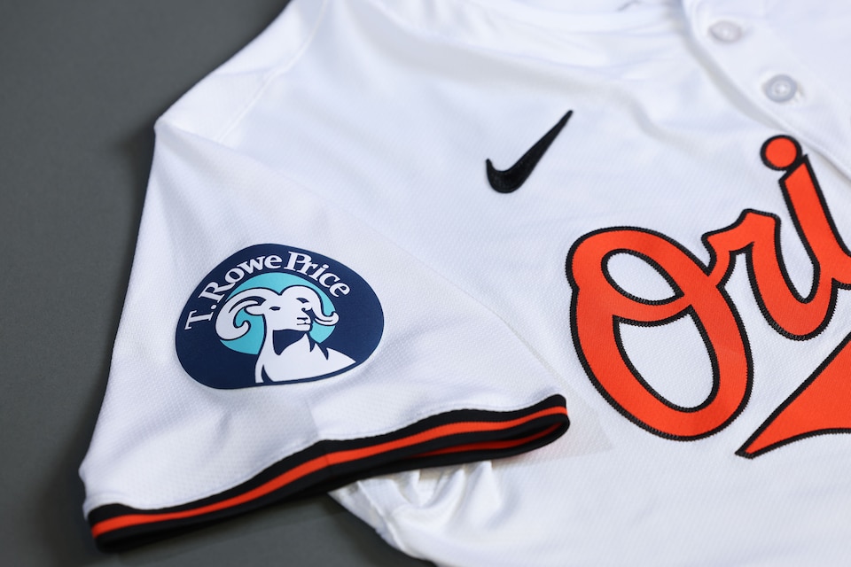
2. The Baltimore Orioles – T. Rowe Price

AHHHHHHHHHHHHHHHHHHHHHHHHHHHHHHHHHHHHHHHHHHHHHHHHHHHHHHHHHHHHHHHHHHHHHHHHHHHHHHHHHHHHHHHHHHHHHHHHHHHHHHHHHHHHHHHHHHHHHHHHHHHHHHHHHHHHHHHHHHHHHHHHHHHHHHHHHHHHHHHHHHHHHHHHHHHHHH
Look at how they massacred my boy.
There is a lot to take in here but I’ll start with the blue. The Orioles just hit their 70 year anniversary of their move to Baltimore and their branding change from the Browns to the Orioles.
In the past 70 years the Orioles Jerseys have always been some combination of orange, black and white and the only time there was even a hint of blue was when they wore patches to honor Jackie Robinson.
This one isn’t just blue it’s two different shades of blue so if your mind is determined enough that it can block the dark blue outer ring don’t worry there is a bright blue center there to make sure that you don’t miss that patch. Putting these 2 different shades of blue on the Orioles’ classic uniforms is offensive.
Now that we have addressed the blue let’s talk about the size because this one is among the very largest the league has to offer. You can’t miss it, you could read the words T. Rowe Price if you were watching the game on an iphone 4.
That brings me to another gripe, they got to put both their name and their animal mascot on the patch. It wasn’t enough to get one or the other; they had to have both. Many of the companies who partnered with MLB teams were flexible and created new versions of their logo to better fit the team’s color scheme, not T. Rowe Price, look at all these different versions of their logo that would have made into a patch instead of that multi colored monstrosity they’ve deposited on the O’s sleeve.


So it looks like they made a brand new particularly gross version of their logo to most clash against the Orioles color scheme.
1. The Toronto Blue Jays – TD Canada

It is crazy that this patch was allowed on a baseball jersey. At least the other clashing patches, the Orioles blue, the Royals red and Braves yellow are colors that you might see on a baseball jersey. This lime green is just not a baseball color and it especially clashes with the Blue Jays crisp red white and blue uniforms.
I don’t like blue on the Orioles jerseys but blue and Orange are complementary colors, the same with the red on the Royals jersey there are lots of teams that have red white and blue color scheme but red white and blue and then a big lime green square is not a color scheme that you would ever choose.
When you watch Jays games that lime green patch is basically glowing on the screen no matter the version of the Jays Jersey it is worn with. I can’t decide what jersey it looks the worst with. It looks bad with the white, it looks bad with the light blue, it looks bad with the dark blue jersey. I can’t remember it on the red jersey but I’m sure it looks bad there too.
Not that the Blue Jays have hundreds of years of branding but their color scheme was so defined and now it just has a big green square on it. And it is big, in this picture I grabbed it doesn’t look too bad but on screen it feels like the whole sleeve is green. It’s undeniably distracting.

Leave a reply to Updated Jersey Patch Rankings – The Dishwasher Cancel reply